A webform element is a field that collects a particular type of data. The Drupal webform module offers a wide variety of prebuilt and preformatted webform elements to choose from. Users should explore the different elements and then apply the ones that best fit their needs.
**reCaptcha the last element of the webform MUST be a reCaptcha to reduce spam. **
Follow the instructions to add an element to a webform, then:
- Select CAPTCHA
- Name the element your site name, underscore, name of the form. Example: dermatology_contact_us, fmch_contact_us, etc.
- save.
- Select Build from the webform menu
- Select Add element
- Explore the element previews using the scrollbar on the right side of the pop-out window.
- Select the Add element button for the desired element
- Be sure to use the pre-designated fields (name, email address, etc.) whenever possible. These fields can be used to create personalized confirmation emails sent to submitter's email address.
- Title the Element
- Certain elements will need specific additional information here. Example: titles of checkboxes, drop down menu items, radio button titles, etc.
- If the element is required, select "FORM VALIDATION" At the bottom of the element box.
- Complete the Required Message to ensure ADA compliance. This will not only show what field needs to be completed, but what information the user needs to provide. Example: "Please provide email address." or "Email address is required."
- Select Save or Save + add element to add another element.
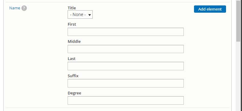
Composite elements are elements that commonly go together, grouped as a single element. Upon selecting a composite element, the user is still able to choose which sub-element they want to use, which ones are required, and which ones are optional.
Example: to collect names in the webform, select the Name element.
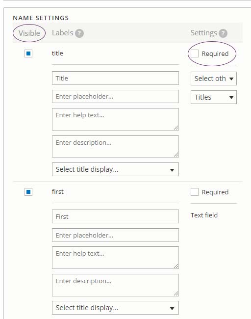
Format composite elements
In the edit element box:
- Unselect the Visible box next to sub-elements that aren't needed. Example: if the title is not needed, unselect the "Visible" checkbox next to the title field.
- If the field is required, select the Required checkbox next to the sub-element. Example: if the first name is required, check the required box next to first.
- The name of the sub-element is editable. Write First Name in the field entitled "first" if that's what should appear on the form.
- Save and add additional standard or composite elements until finished.
About Flexboxes
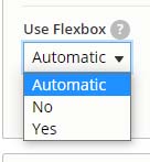
Flexboxes offer the option to arrange webform elements horizontally instead of vertically. Select Yes from the Use Flexbox dropdown menu at the bottom of the composite element field to see how it will look.
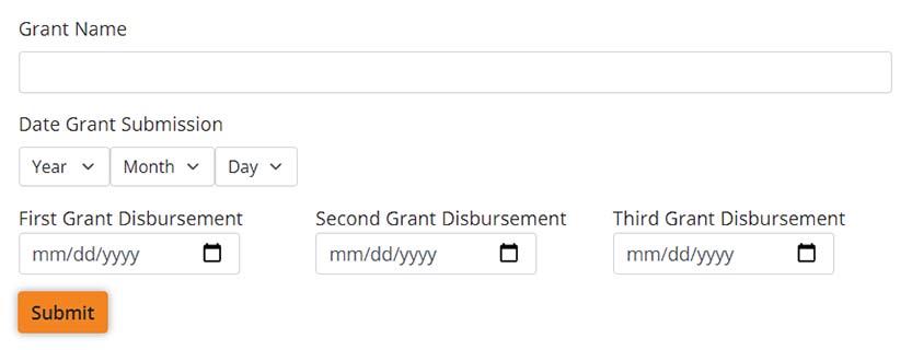
See: Standard vs. Flexbox Composite element
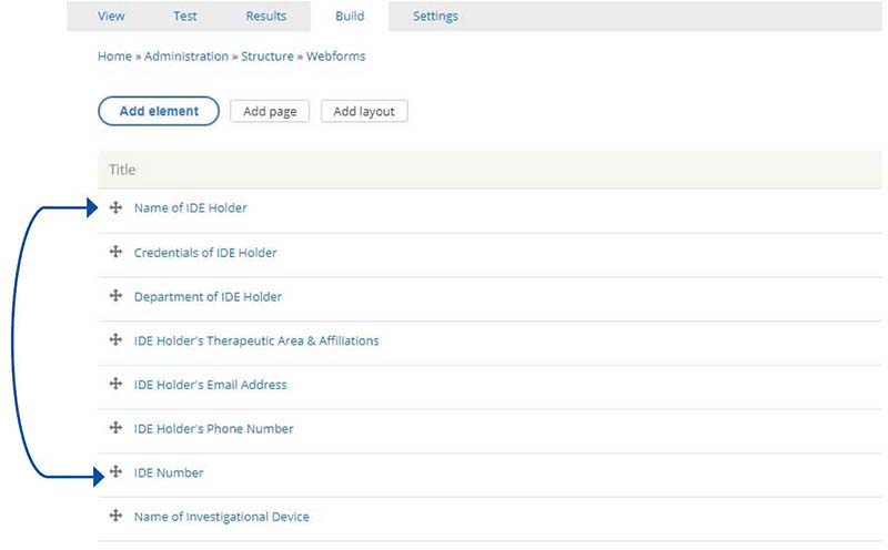
The order of the elements can be arranged by clicking on the crosshairs to the left of the form element name and sliding them up and down the list. Be sure to save the configuration before viewing the form.
Add Flexbox
Flexboxes offer the option to arrange webform elements horizontally instead of vertically. Each added flexbox creates a single line of elements. Experiment with adding elements to a flexbox to see how it looks on the form. When using composite elements, use the flexbox option within the composite element edit box.
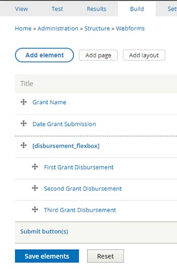
- Select the Build tab from the Webform menu
- Select the Add Layout button
- Name the flexbox something that makes sense for the elements that will be in that box. (on that line)
- Save
- Drag the flexbox up the list of elements to just above the first element that should be in the flexbox.
- Push the first element for the flexbox to the right so that it is indented in the flexbox.
- Add additional elements
- Save.
Limit the number of elements in a flexbox to ensure the field title and the box remain on a single line. Flexboxes can be stacked to reduce the length of a form.