Add an Icon Row
Icon Rows are used to feature navigation on Landing Pages and Division/Unit pages. They are essentially large, graphic navigational buttons, that showcase an image as well as text to highlight the content to which user is being directed. See Below
Additional Examples
About Icon Rows
- Icon Rows consist of white 'buttons' to which can be added images and text on either a plain blue background or a geometric blue background.
- The width of each icon adjusts to fill the page depending on how many icons are used. Fewer icons in a row, make each icon wider. More icons in a row, make each icon narrower
- The height of all of the icons will adjust to the height of the tallest icon's text and image.
About images in Icon Rows
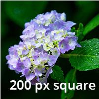
- Images will shrink to fit in the icon, however, small images will not render larger.
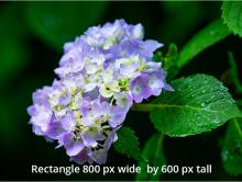
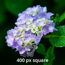
- The overall dimensions of the image will remain the same. Square images will remain square, rectangle images will remain rectangles.
- Recommended size of an icon image is at least 200 px square
- See Working with the Media Library for information about working with images
- Catalog of Icons for icon rows.
Add an Icon Row
- Select the Paragraph Tab
- Select Add Icon Row from the Content Box drop-down list.
- Add an Administrative Title to help you remember the purpose of the icon row during later edits.
-
- Add an optional Display Title that will appear above the icon row.
- Select the Background style
- Select Add Icon Item
- To add an icon image, select the Add media button. See Working with the Media Library for additional help.
- Add a optional Heading.
- Add Icon Text
- Add Icon URL by typing the name of the page to which the Icon is to link. A list will populate of potential pages. Select the desired content.
- Select Add Icon Item to add additional icons, up to four.
- Save